
WNC DEC Brand Assets
These are all of the elements of our visual identity. If you’re partnering with or promoting us, please refer to the guidelines and downloads below!
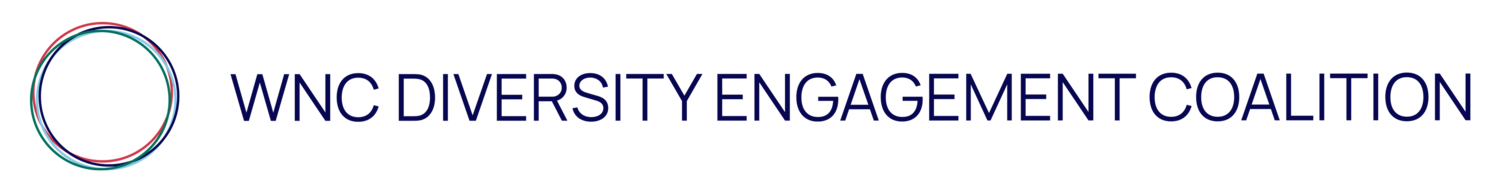
Our Logo
THE WORDMARK

The Wordmark is the most identifiable identifier of our brand. It is the fullest expression or our logo and works particularly well in instances where groups may not have heard of us or in horizontal spaces.
We have 2 additional versions of our Wordmark that work well in different orientations: see below

THE CIRCULAR SYMBOL

The Circular Symbol works well on it’s own in instances where groups are familiar with our brand. It works well as an icon or in a context where you may want a little bit of creative variety within our brand assets.
THE RIPPLE SYMBOL

The Ripple Symbol works much like the circular symbol.
It works particularly well in a context where our Wordmark has already been used and you may want to expand on our branding in a more playful way.
HOW TO USE
CLEAR SPACE & COLOR
All of our logos work best when used in full color and with enough white space around the logo so it can breath (approximately the width of the circular symbol.)

